HTML Visualization
(New Feature!) OpenBox now provides HTML visualization for users to monitor and analyze the optimization process. In this tutorial, we will explain how to use HTML visualization and understand the visualization outputs in OpenBox.
How to use HTML Visualization
We assume that you already know how to set up a problem in OpenBox. If not, please refer to the Quick Start Tutorial.
Here we visualize the optimization process based on an example from Multi-Objective Black-box Optimization with Constraints.
Turn on visualization before optimization
To turn on HTML visualization, just set visualization = basic or advanced when defining an Optimizer.
And set auto_open_html = True to automatically open the visualization page in your browser:
from openbox import Optimizer
opt = Optimizer(
    ...,
    visualization='advanced',  # or 'basic'. For 'advanced', run 'pip install lightgbm shap' first
    auto_open_html=True,       # open the html file automatically
    task_id='example_task',
    logging_dir='logs',
)
history = opt.run()
There are 3 options for visualization:
‘none’: Run the task without visualization. No additional files are generated. Better for running massive experiments.
‘basic’: Run the task with basic visualization, including basic charts for objectives and constraints.
‘advanced’: Enable visualization with advanced functions, including surrogate fitting analysis and hyperparameter importance analysis.
Note: to use the hyperparameter importance analysis, additional packages,
shap and lightgbm, are required (run pip install shap lightgbm first).
Once the Optimizer is initialized, an HTML page will be generated under ${logging_dir}/history/${task_id}/.
Then, open the HTML page in your browser, and you can see the visualization of the optimization process.
During the optimization, you can click the Refresh button to update the visualization results.
Visualization after optimization
If you forget to set visualization in Optimizer, don’t worry,
you can also start the visualization after the optimization ends.
And set open_html to True to automatically open the visualization page in your browser:
history = opt.get_history()
history.visualize_html(
    open_html=True,  # open the html file automatically
    show_importance=True,
    verify_surrogate=True,
    optimizer=opt,
)
An HTML page is then generated in ${logging_dir}/history/${task_id}/.
Also note that if show_importance=True, additional packages, shap and lightgbm,
are required to be installed (run pip install shap lightgbm first).
Basic Visualization
1 Objective Function
1.1 Objective Value Chart
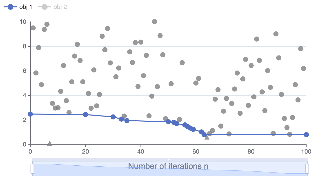
This example shows the objective value of each suggested configuration during optimization.
For constrained problems, a configuration that satisfies the constriants will be plotted as a circle \(\bigcirc\), Otherwise, a triangle \(\triangle\).
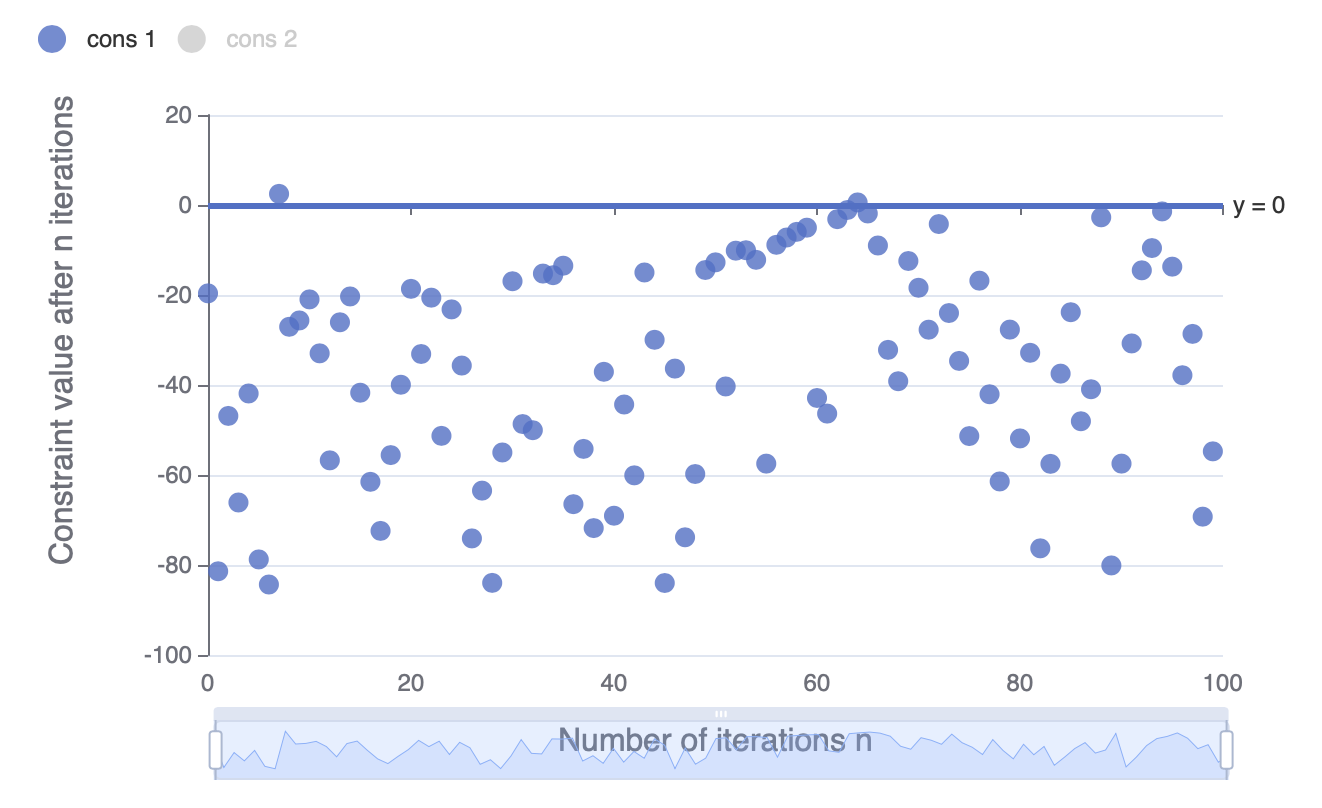
1.2 Constraint Value Chart
This visualization is only available for constrained problems.
This example shows the constraint value of each suggested configuration during optimization. By default, non-positive constraint values (“<=0”) imply feasibility.
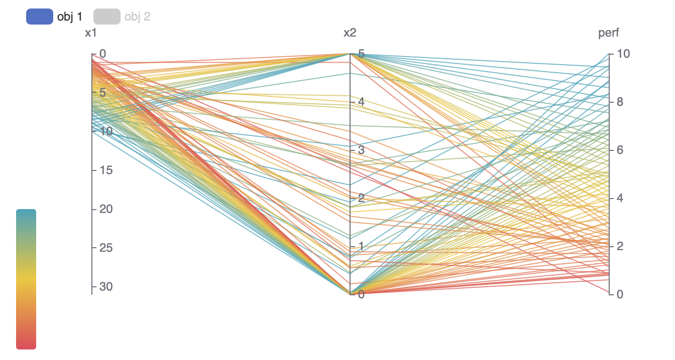
1.3 Parallel Coordinates Chart
This example shows the parameter values and objective values of each individual observation.
2 Multiple objectives
This part is only available for multi-objective problems.
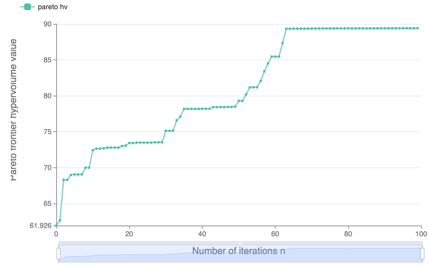
In multi-objective problems, since we do not know which objective is the most important, we search for a set of pareto optimal solutions. A pareto optimal solution means that it cannot be improved in any of the objectives without degrading at least one of the other objective. All pareto optimal solutions form a pareto frontier. Our target is to maximize the HyperVolume from a reference point to the pareto frontier.
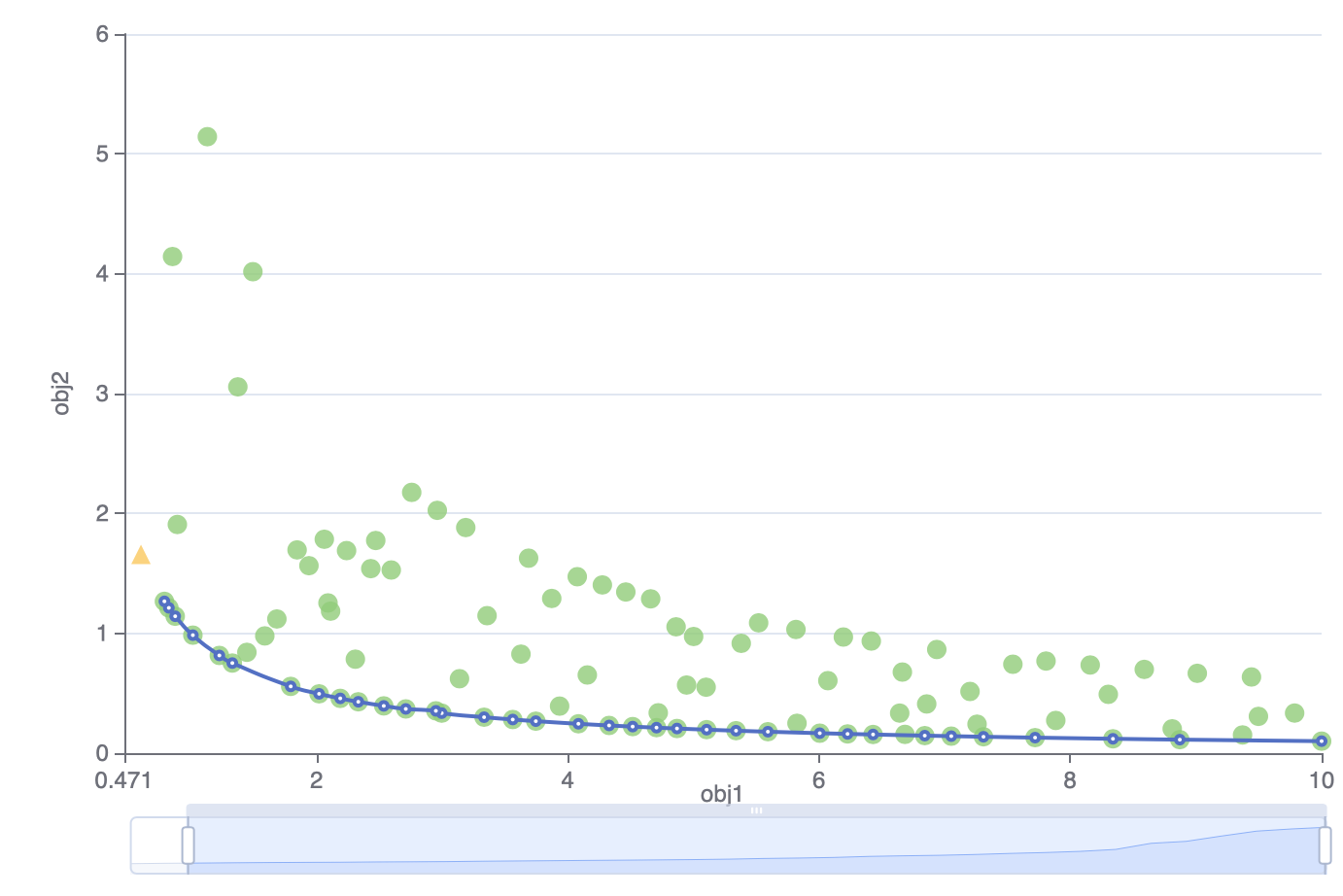
2.1 Pareto Frontier
The visualization of Pareto frontier is only available for problems with two or three objectives.
The Pareto frontier is shown as a curve (2 objectives) or a surface (3 objectives). For constrained problems, a configuration that satisfies the constriants is shown as circle \(\bigcirc\). Otherwise, a triangle \(\triangle\).
2.2 Pareto Frontier Hypervolume
This example shows the hypervolume value surrounded by the pareto frontier in each iteration.
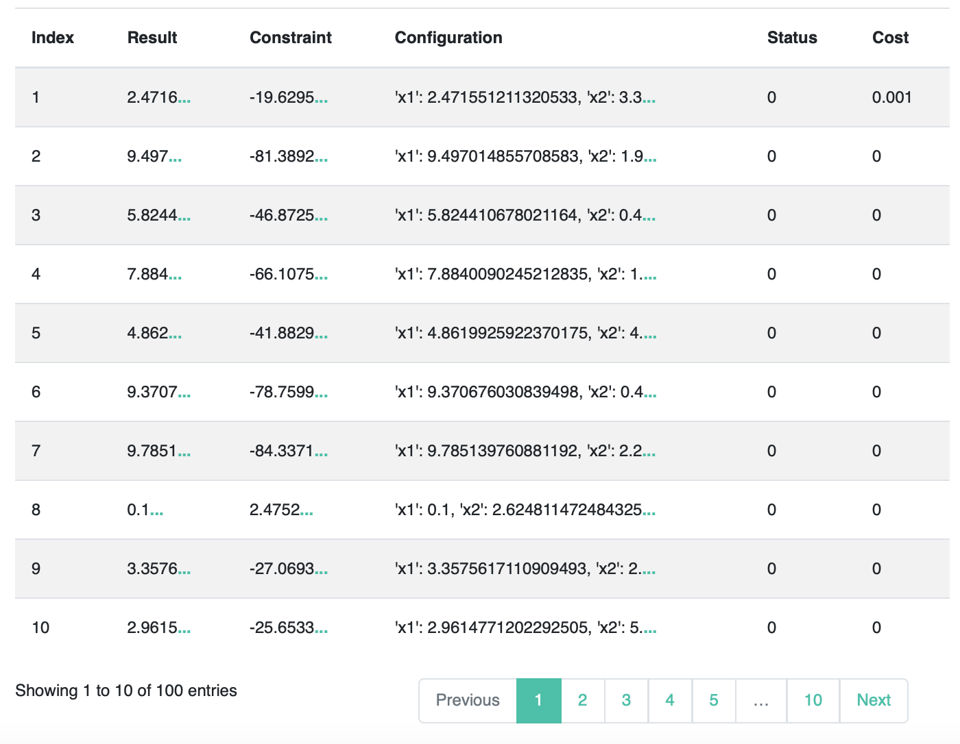
3 Historical Configurations
This table records the information of each observation. Since the space is limited to show all information (e.g., all parameter values), you can click the “…” beside it to see more details.
Advanced Visualization
1 Surrogate Model
During black-box optimization, surrogate models are trained to fit the relationship between configurations and objective values. We visualize surrogate models to show their performance.
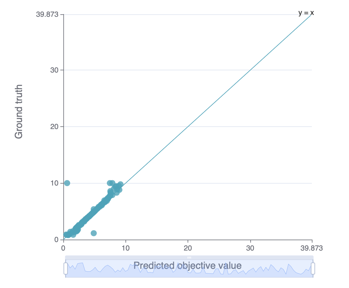
1.1 Predicted Objective Value
This example shows the relationship between the ground-truth and predicted objective values (based on cross validation). The x-axis is the predicted objective value from the surrogate model and the Y-axis is the ground-truth value. The closer the dots are to the line y=x, the better the generalization ability of the surrogate model is.
1.2 Predicted Objective Value Rank
Remind that black-box optimization only aims to find a configuration that minimizes the target rather than precisely predict the ground-truth value of each given configuration. Here we provide a rank chart, which is similar to Predicted Objective Value. We rank the configurations based on their predicted and ground-truth objective values. The x-axis is the predicted objective value rank from surrogate model, and the y-axis is the ground-truth value rank. The closer the dots are to the line y=x, the better the rank ability of the surrogate model is.
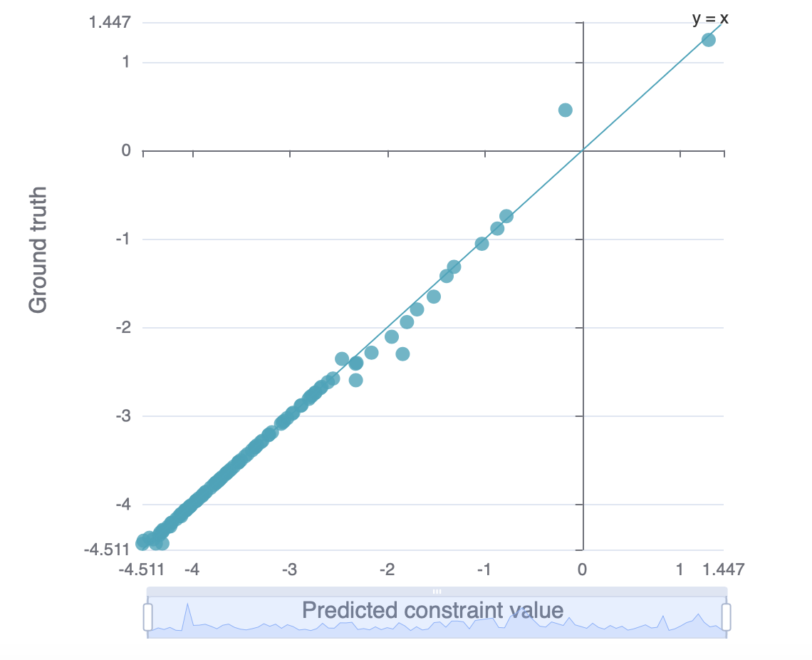
1.3 Predicted Constraint Value
This chart is only available for constrained problems.
Besides objective values, we can also use surrogate model to predict constraint value. This chart is similar to Predicted Objective Value, except that we predict the constraint values here.
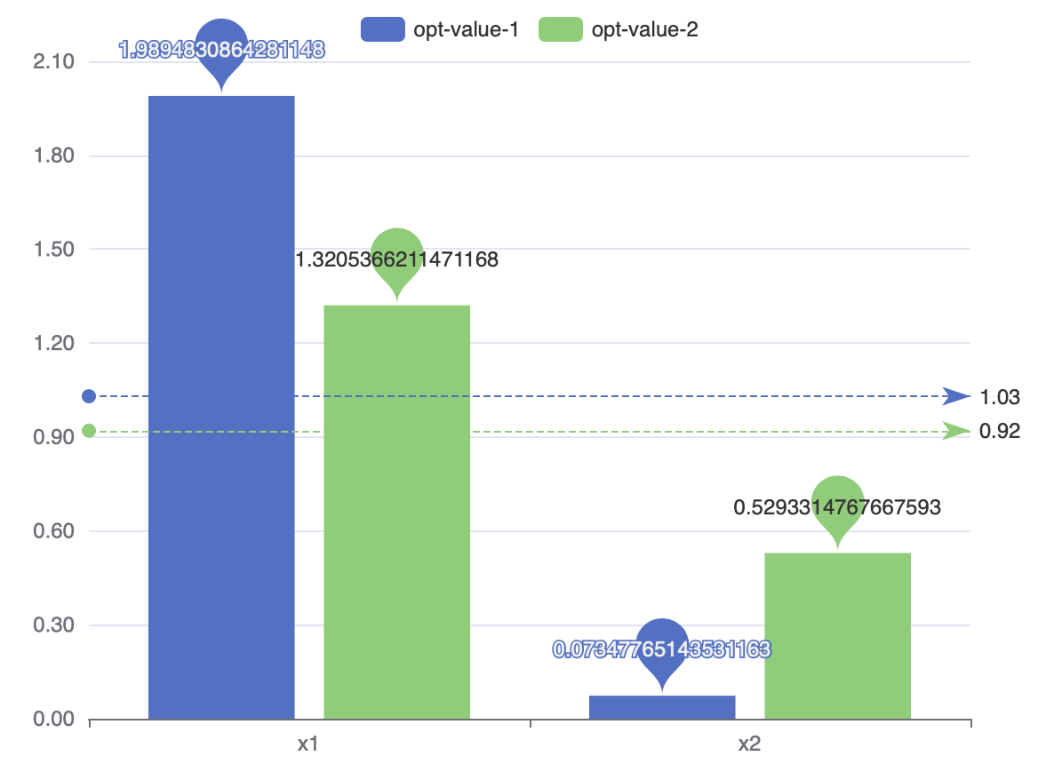
2 Parameter Importance
We use SHAP (SHapley Additive exPlanations) to estimate the parameter importance. For More information about SHAP, please refer to SHAP documentation.
2.1 Overall Parameter Importance
This chart shows the importance of each parameter to the objective. The higher the importance value is, the greater this parameter influences the objective, whether in a positive way or an negative way.
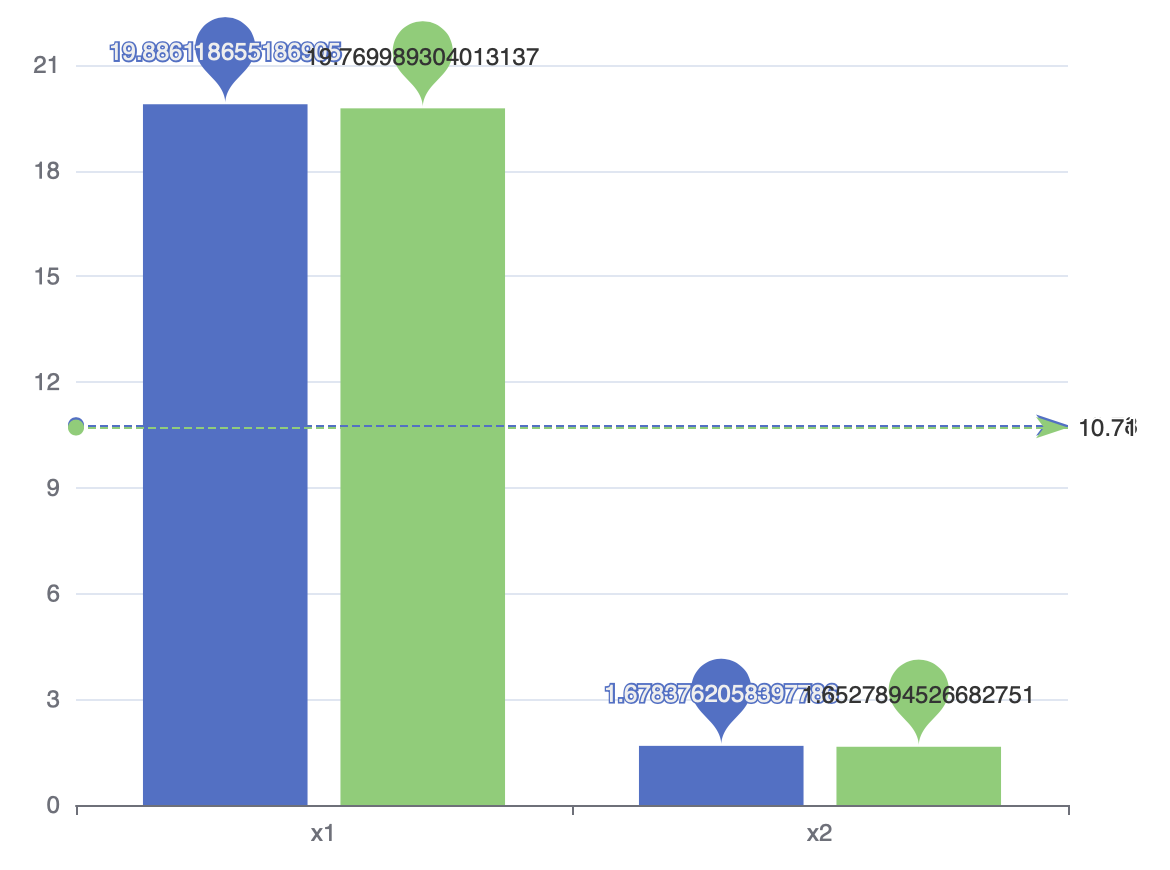
2.2 Overall Parameter Importance to Constraints
This chart shows the importance of each parameter to the constraints. The higher the importance value is, the greater this parameter influences the constraints, whether in a positive way or an negative way.the objective, whether in a positive way or an negative way.
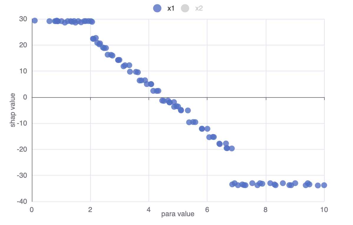
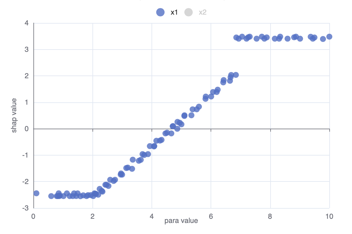
2.3 Individual Parameter Importance
This chart shows how the objective depends on the given parameter. The x-axis is the value of the parameter, and the y-axis is its SHAP value. The absolute SHAP value represents the influence intensity, where a positive value implies a positive correlation. You can click the label on the top to switch parameter.
For multi-objective problems, You can select the objectives from the drop-down box above the figure.
2.4 Individual Parameter Importance to Constraints
This chart shows how the constraints depend on the given parameter. The x-axis is the value of the parameter, and the y-axis is its SHAP value. The absolute SHAP value represents the influence intensity, where a positive value implies a positive correlation. You can click the label on the top to switch parameter.
You can select the constraint from the drop-down box above the figure if there are more than one constraints.